

Last Updated: September 4, 2026
Understanding Colour Theory in Custom Kit Design
Colour theory determines how your team's kit looks on the road, podium, and in photographs. For cycling clubs and triathlon teams, your colour choices become your visual identity, influencing sponsor appeal and teammate visibility in races. Teams that invest time understanding colour relationships consistently produce professional-looking kits.
Complementary colours (opposite on the wheel) create high visual energy; analogous colours (adjacent) deliver cohesion. Your primary and secondary colours should work together across shorts, jersey, and accessories rather than competing for attention.
CMYK vs RGB for Apparel Printing: Which Method Matters
CMYK is the correct colour space for apparel printing; RGB is for digital screens. RGB displays a wider gamut than CMYK, so a vibrant orange on your monitor cannot be reproduced at the same saturation on fabric.
Converting RGB to CMYK: The Technical Process
Converting RGB to CMYK requires selecting the correct ICC colour profile for your printing method and fabric type. Polyester absorbs dyes differently than cotton, and the profile must account for this to predict the final shade accurately.
Request your manufacturer's ICC colour profile. If your club colours are tied to brand identity, obtain the Pantone reference number from your sponsor or governing body. Provide both CMYK values and Pantone reference to your manufacturer to catch conversion errors before printing.
Dye Lot Variation and Fabric Substrate Impact
Even with correct CMYK values, the final colour depends on the dye lot (batch of fabric dyed at the same time). Two dye lots can show visible colour shifts. Physical samples are non-negotiable, they verify the specific dye lot for your production run.
Examine samples under both natural daylight and artificial lighting, as colours shift under different light sources. Document approval with a photograph taken under the lighting conditions where your team will compete, and retain the sample for future reference.
Avoiding Colour Shift in Sublimation vs. Screen Printing
Sublimation embeds dye into polyester fibres, producing vibrant colours with minimal shift; it requires 100% polyester or high-polyester blend (peer-reviewed research). Screen printing applies ink to any fibre type but can shift colours through opacity and layering. If your design uses overlapping colours, request a sample showing these overlaps.
Confirm your manufacturer's printing method and request a physical colour reference before full production. This eliminates most colour-matching disputes.
How to Choose a Team Colour Palette That Works
A successful palette balances brand identity, visibility, and performance across varied lighting. Select one dominant colour, one secondary colour, and maybe one accent shade with sufficient contrast. Consider how colours perform in reduced light, where similar tones become indistinguishable.
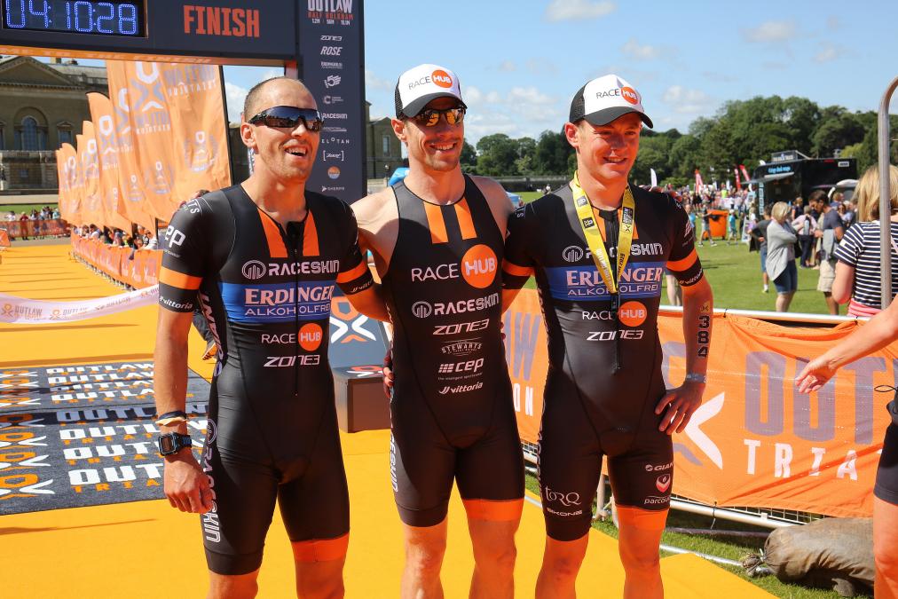
Close-up of triathlon club members in matching custom kits standing getting a finish line photo together.
Bold hues like red and orange project speed; blue communicates reliability. Use colour blocking to place primary colour on the torso for visibility and darker shades on lower panels where dirt is more likely.
Avoiding Colour Clash in Sports Kits
Colour clash occurs when competing teams wear similar kits. UK cycling and triathlon regulations require distinguishable kits (britishcycling.org.uk). A common mistake is focusing only on jersey colour while ignoring shorts, which can still cause confusion.
Contrast ratio between your kit and competitors' is the technical measure that matters. High contrast ensures identifiability from distance and peripheral vision. Research rival clubs' colours and avoid the same hue families.
Measuring Contrast Ratio for Regulatory Compliance and Visibility
Contrast ratio quantifies how visually distinct two colours are, ranging from 1:1 (identical) to 21:1 (maximum contrast). While not yet universally mandated, it is critical for compliance and visibility.
Use the WCAG relative luminance formula to calculate contrast ratio. A ratio of 3:1 is acceptable for general visibility; 4.5:1 is recommended for text; 7:1 is the gold standard for variable lighting.
Apply contrast ratio to your jersey versus shorts, and critically to player numbers and text. Dark navy numbers on dark navy background may only achieve 2:1 contrast and are difficult to read. Use an online WCAG contrast ratio calculator to verify at least 4.5:1 ratio.
Accessibility and Readability: A Growing Regulatory Trend
Several UK sports governing bodies are beginning to require minimum contrast ratios for player numbers and logos. High contrast ratios ensure readability for athletes with colour vision deficiency (affecting approximately 8% of men and 0.5% of women) (peer-reviewed research).
Ensure text, numbers, and logos meet minimum 4.5:1 contrast ratio. White numbers on dark navy achieve 8:1 contrast; dark grey on dark navy achieves only 2:1. Request contrast ratio values for all elements before sample approval.
Clash Prevention: Proactive Research and Documentation
Contact your governing body for current kit clash guidelines. Document competitors' colours and verify your palette differs by at least 3:1 contrast ratio from their primary colours.
If competing in multiple disciplines, check rules for each separately. Retain documentation of colour choices (CMYK values, Pantone references, contrast ratios) in case disputes arise.
Custom Kit Colour Matching: Step-by-Step Process
Accurate colour reproduction requires a structured workflow with four stages, each designed to catch errors before expensive production mistakes.
Step 1: Prepare Your Design Files and Colour Specifications
Finalise your design in vector format using CMYK colour values. Document the CMYK breakdown for each colour. If tied to brand identity, request the Pantone reference from your sponsor or governing body.
Step 2: Select Your Printing Method and Verify Colour Accuracy
Sublimation embeds dye into fabric fibres, producing vibrant, permanent colours ideal for performance apparel. Screen printing applies ink to the surface, works for simple designs, but can affect breathability and durability.
Printing Method |
Colour Vibrancy |
Durability |
Best For |
|---|---|---|---|
Sublimation |
High, full-colour |
Excellent, no peeling |
Complex designs, performance kits |
Screen Printing |
Good, limited colours |
Good, may crack over time |
Simple logos, small runs |
Step 3: Request and Review Digital Mockups
Review digital mockups showing your design on the actual garment template. Provide feedback on shade accuracy at this stage, as digital revisions are cheaper than correcting printed garments.
Step 4: Approve A Colour Swatch Before Full Production
Here at Raceskin we can provide a physical sample of the colour for customers to chose before kit goes into full production. Review under natural and artificial lighting, and confirm the exact shade of colour you want to use. It’s worth remembering the same colour printed on different fabrics can affect final colour.
Governing Body Regulation Compliance for Kit Colours
Colour choices must comply with governing body regulations. UK cycling and triathlon bodies publish guidance on kit design, sponsor placement, and colour visibility. Non-compliance can result in fines or disqualification.
Review the current rulebook for your sport. Pay attention to crest placement (often with minimum size requirements) and colour restrictions. If competing across multiple disciplines, verify a single design satisfies all regulations.
Common Mistakes to Avoid When Matching Kit Colours
The most frequent error is approving colours based on screen without seeing a physical colour swatch sample printed on material. Screen calibration varies widely and bright backlit colours won't translate to fabric. Different textile blends absorb dyes differently, producing noticeable variations.
Teams underestimate contrast ratio importance for accessibility. Low-contrast designs are difficult to read and dangerous in races. Avoid last-minute design changes after sample approval, as minor adjustments produce unexpected results.
Conclusion
Getting your custom kit colour matching right comes down to preparation, communication, and verification at every stage of the process. Start with a solid understanding of colour theory and CMYK printing limitations, choose a palette with genuine contrast, and never skip the physical sample approval step. A kit that represents your team well is an investment in your club's identity and performance.
At Raceskin, our dedicated designer works with clubs and teams through every stage of this process, from initial palette selection to final sample approval. We understand that consistent sizing and accurate colour reproduction matter as much as the performance of the garment itself. Get race ready and start your custom kit project with confidence, knowing your colours will look right from the first ride to the final sprint of the season.
Frequently Asked Questions
How do I ensure my custom kit colours match my club logo?
Request Pantone colour codes from your logo designer and provide these to your kit supplier alongside hex codes and CMYK values. Use digital mockups to verify the match before approving production. Ask your supplier about their colour matching tolerance. Always request a physical sample swatch in your chosen fabrics before committing to a full order, as ink colours can shift slightly depending on the base textile.
What is the difference between RGB and CMYK for custom kit printing?
RGB (red, green, blue) is used for digital displays like screens and mockups, whilst CMYK (cyan, magenta, yellow, black) is the standard for physical printing on fabric. Colours that look vibrant on your computer screen may appear duller when printed because RGB and CMYK have different colour ranges. Always convert your design files to CMYK before sending to your kit manufacturer, and request a colour-managed proof to see how your design will actually appear on the finished kit.
How do I avoid colour clashes between home and away kits?
Use a colour wheel to select palettes with sufficient contrast—complementary colours (opposite on the wheel) work well for home and away combinations. Check contrast ratios using accessibility tools; aim for at least a 4.5:1 ratio between your primary kit colour and secondary colours for visibility. Consider how colours appear under different lighting conditions, including indoor venues and outdoor races. Test your chosen palette against potential opposition teams in your league to prevent accidental clashes on match day.
Why do my printed kit colours look different from my screen?
Screen displays use RGB light, whilst printed fabrics use CMYK pigments—these colour spaces don't match perfectly. Monitor brightness, colour calibration, and ambient lighting all affect how colours appear on screen. Fabric type, dye method (sublimation vs. traditional printing), and the base colour of your textile also influence the final result. This is why requesting physical samples and colour-managed proofs from your supplier is essential before full production.